Project highlights
- Provide interactive mobile app design for smooth navigation
- Build accurate and optimal routes inside an office building
- Maximize space to boost employee satisfaction and productivity
- Industry:
- UI/UX, LBS, Real Estate
- Team size:
- 7 members
- Project duration:
- 4 months
Business challenge
As a rapidly growing company with 1,500 specialists and 12 office locations in four countries, Intellias needed a unified wayfinding solution to assist employees in navigating distributed office environments. The challenge was twofold. The first task was to create a user-friendly map navigation system that would transform the workplace experience for all employees. The second task was to build an interactive mobile UI/UX design for a pocket guide app to put office maps on everyone’s devices.
Having studied indoor navigation solutions offered on the market, our team defined a set of starting points for the project:
- To accommodate our increasing number of office spaces along with extensive travel between offices, we required a single, uniform approach to navigation across all Intellias locations. This would allow employees to efficiently move around any Intellias office, whether new or familiar.
- The map navigation system in Intellias offices needed to be clear, concise, and easily understood by both office occupants and visitors. It shouldn’t take users more than a couple of seconds to identify their location and find the place they’re looking for.
- The mobile app design for the guide application needed to be straightforward to ease users into the navigation experience and remove the stress of locating colleagues, rooms, and resources.
- Our mobile solution also needed to provide visibility for optimizing office spaces, planning moves, assessing capacity, evaluating seating availability, etc.
Based on these benchmarks and our experience in indoor positioning and mapping, we embarked on the journey of developing the Intellias office navigation solution.
Solution delivered
Our very first step was to conduct user research to put ourselves in the shoes of employees holding different roles and working with Intellias for different periods of time. Getting to know our audience’s needs set us on the right track toward building a viable navigation system that would provide the necessary guidance to each Intellias employee.
User personas
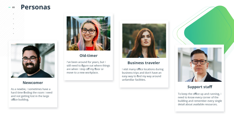
To address the real needs of Intellias employees, our design team singled out four user personas, each having totally different pain points but all in need of reliable navigation support.
While newcomers were scrambling to find their way around the office, old-timers still had to search for rooms and people each time they found themselves on a different floor or wing of a building. Frequent business travelers needed a universal wayfinding system shared across all company locations and offices. And our support staff, responsible for equipment supply, resource provision, and office maintenance, didn’t have enough information on the whereabouts of all office facilities.

Solution roadmap
Delving deeper into the context of the workplace environment, we wrote a list of assumptions of what the users’ navigation experience might be like. We then surveyed Intellias employees to see whether those assumptions held true for our office context. Based on this survey, we worked out a roadmap for building a transparent office navigation system:
- Printed floor plans should be available on every floor and in every office, accompanied by navigation hints to give additional directions.
- A mobile app with an interactive design should provide online maps of all Intellias offices and offer offline access to critical information so users can check floor plans, view contact details, and get guidance without an internet connection.
- Our mobile solution should feature search functionality to locate a specific office facility or workplace and build a route from the user’s current position to any office object so the user can quickly reach it.
- The app should also provide a booking option and all information on a room’s availability, capacity, and equipment.
Map navigation system
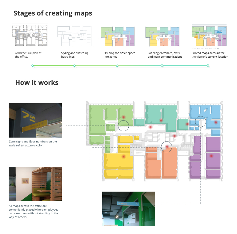
By putting the user experience first, we aimed to build a clear-cut interaction design to make our office navigation system as self-explanatory as possible. Creating indoor navigation maps was an essential part of this task. We completed the process in several stages that included sketching and styling basic lines of the map according to the architectural plan, splitting the office space into zones, labeling entrances and exits, and adjusting maps according to the user’s current location.

When implementing an indoor navigation system, we stuck to the same patterns in all offices in terms of zones, colors, signs, and map placements. This assures frictionless navigation for employees, making them feel comfortable moving around an Intellias office even if they’ve never been to that particular location.
Zones
We divided all office spaces into smaller zones named according to parts of the world. The zoning system is consistent across all Intellias locations, which makes it predictable and intuitive.
Colors
Our design team conducted color perception research among Intellias employees. Based on employee preferences, we introduced color coding for each zone and used zone colors for both office maps and the interior design. This enhances visual communication when users are reading a map or navigating the office.
Signs, icons, and stickers
Zone signboards, floor numbers, column signs, room names, and directional arrows are the same color as the zone in which they’re located. All other rooms (kitchens, utility rooms, WCs, and smoking areas) share a single color and are indicated with icons. Stickers are used on cupboard doors in the office kitchens to show what’s inside.
Map placement
Floor plans with all zones, rooms, and directions to them are set up on each floor of the office. We placed maps at an optimal distance from other office objects so viewers can see map details while leaving plenty of room for others to pass by.
Usability testing
As with any new solution, our successful implementation of printed navigation maps was the product of iterative testing and continuous improvement. To reveal potential usability gaps, our team ran a series of tests with wall maps in the actual office environment.

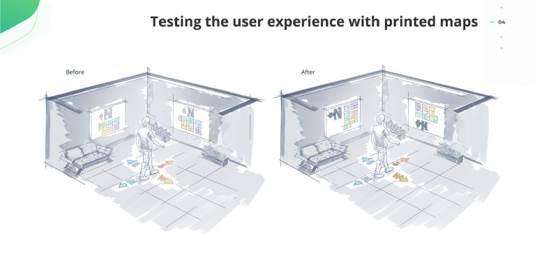
We found that our first set of maps were not informative enough because they were all hung with north facing up and didn’t necessarily reflect the user’s orientation in the office. We tried rotating maps depending on the user’s orientation and discovered this alternative was much more convenient for users and allowed them to efficiently use the maps. As a result, we built four different versions of each map and hung them up according to the zone in which the map was placed.
The impact of this change was evidenced in our testing:
- The average time required for finding a new room on the map was cut in half, from 9 to 4.5 seconds.
- The average time spent by users near the map was slashed from 11 to 2 seconds.
- The number of employees using wall maps increased from 4 to 20 per day.
Thus, the perceptibility of information and consequently the number of map users rose while the time spent for navigation fell.
Mobile solution
The next big stage for our team is developing a custom mobile app that incorporates digital office maps and allows employees to access interactive floorplans through their phones. This application is intended to give users all essential information and provide instant office guidance when needed.
Our mobile mapping solution connects to an indoor positioning system based on a network of high-precision Bluetooth beacons already installed in one of the Intellias offices for testing. What differentiates our solution from regular indoor navigation systems is that beacon positioning technology makes it much more accurate and responsive to the dynamic workplace environment. The volatile nature of the office generates constant changes, from the location of departments to the contents of kitchen cupboards. Beacons automatically track these changes and update the floor plan details as well as people’s positions in real time.
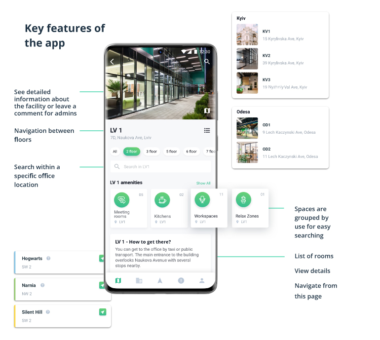
Along with a clean and intuitive UI design, we carefully designed the mobile UX to give users a fast, optimized, and fluid navigation experience. The app simplifies daily workplace challenges by allowing users to view details about a facility, search for people and objects within a specific location, book rooms with ease, build routes, navigate to waypoints, and more.

Our solution serves as a visual directory with information on important contacts, office floor plans, peoples’ workplaces, room availability, space occupancy, and office equipment — all available in online and offline mode. The app’s routing capabilities ensure smooth movement of employees between floors using escalators, elevators, stairs, and ramps.
Business outcome
Backed by Intellias strong design expertise, our team implemented an efficient office map navigation system for all company’s locations. Equipping offices with well-designed and user-friendly offline and online maps already has had a favorable impact on different aspects of our employee’s office experience:
- Stress-free onboarding for newcomers
- Enhanced workplace performance thanks to the system’s search capabilities
- Higher employee satisfaction with the work environment
- Seamless navigation for clients and employees from other offices
As an innovative and forward-thinking company, Intellias intends to put a smart and user-centric guide into employees’ hands to help them navigate the workplace, stay focused on their tasks, and save time. Our first-class mobile UI/UX design for our indoor mapping and search solution is an essential milestone toward accomplishing that goal. Packed with navigational prompts and other useful features, the app is an effective wayfinding tool and a robust search engine for every user.
Given the rising global demand for indoor mapping, positioning, and routing technology, our Intellias navigation solution can be scaled for a variety of use cases including for airports, hospitals, conference venues, and other large facilities.
Check out our Behance presentation for a visual overview of the Intellias office navigation system.