When the FinTech industry was just coming of age, most companies launched with one simple offering: a mobile wallet, debit card, or spare change investing app.
Those products were a hit with users who were still hesitant to trust their hard-earned money to an app.
But the customer base has matured rapidly. According to Capgemini, 52% of retail banking consumers used three or more FinTech apps to supplement services offered by their bank in 2017.
Today, there’s a newer trend growing around FinTech: platformization.
FinTech apps are rapidly transforming customer experience and evolving from utility apps (that do one thing great) into one-stop solutions for all things financial:
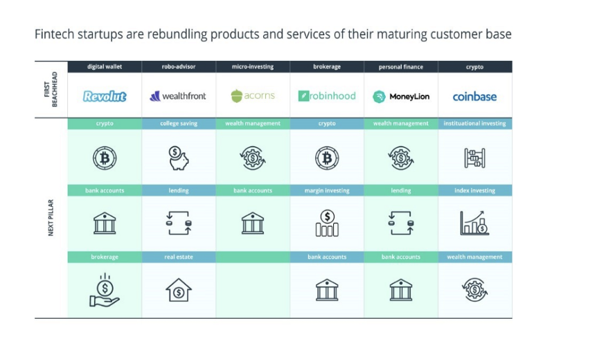
Source: CB Insights
This move is happening because app fatigue is real. And when it comes to finances, the majority (85%) of millennial users would rather bank with one financial institution that offers a comprehensive range of services.
The good news? Most FinTech players are succeeding at building an ecosystem of in-app services using cutting-edge technology. They’re moving away from being solutions and becoming
superapps — platforms featuring a collection of connected financial and lifestyle services ranging from wealth management to crypto investing, networking services, and discounts at retailers.
Now comes the pinch of salt: as FinTech platforms grow more complex and feature-heavy, users start complaining about feature/information overload — the exact reason they ditched incumbent banks for “intuitive” FinTech apps in the first place.
And herein lies the problem: building a technologically advanced financial product is just part of the deal. If the product’s logic is too complex and the customers’ path toward their financial goals is too twisted, you’ll inevitably lose customers somewhere along the way. So, how to improve customer engagement in banking?
Offering less with more is the new challenge for mature FinTechs.
But it’s a solvable one using the Customer Experience (CX) = Machine Learning (ML) + User Experience (UX) formula.
Why a customer-centered approach to FinTech product development is the new way to go
Millennials are often labeled as the self-absorbed and selfish generation. As a millennial myself, I believe these stereotypes to be generally inaccurate — but they’re actually true when it comes to banking.
Here’s the thing: I don’t look for specific banking products. I look for solutions to fulfill my (selfish) at-the-moment needs: finding ways to save for a trip abroad, setting aside money for my wedding, or just assessing the feasibility of ever buying a house in an area I want.
My customer journey is strongly aligned with my life needs. And yet, instead of placing users’ needs in the spotlight, most FinTech product owners construct customer journeys around products in their portfolio.
As a result, customers just don’t see the What’s in it for me? component in your pitches. So much so that 40% of millennials say they do not receive any personalized offers from their primary bank and an additional 46% say that their bank does not pitch marketing offers relevant to future purchase plans.
But most retail banking consumers do want to feel special at all stages of the banking journey:
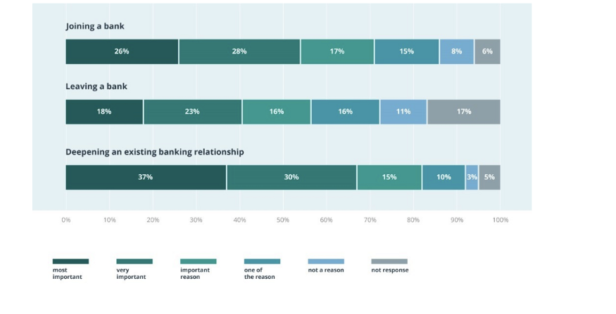
Source: The Financial Brand
The good news? Unlike incumbent banks, FinTechs already have almost everything they need to deliver a more personalized experience to users.
The fix: Deploy predictive analytics to suggest the next best action
FinTechs often sit on a goldmine of rich data on customers’ transactions and life stages without giving it much thought.
It’s time to free that data from product silos. By doing so, you can switch from managing a group of accounts toward managing individual customers in the way they want to be managed.
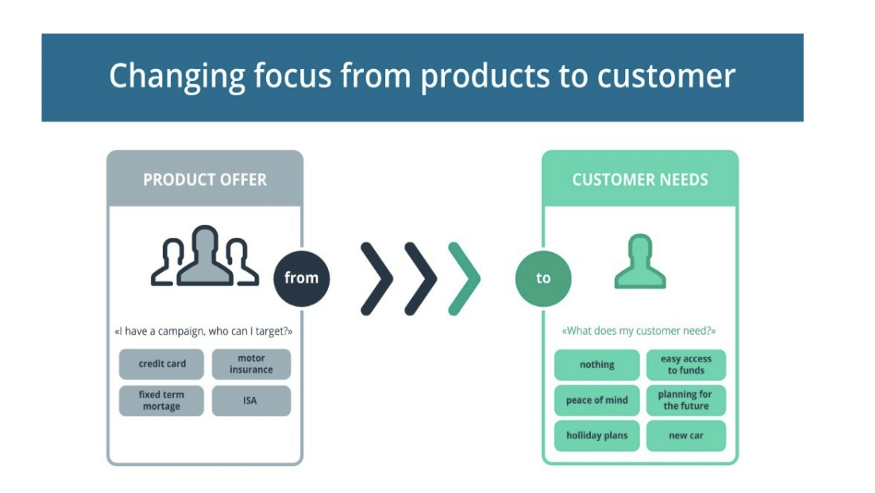
Source: Deloitte
But how can you know your customers’ needs?
- Use the data at hand
- Design machine learning algorithms to crunch the numbers for you
- Receive next best action suggestions
Here’s a quick example of defining customer requirements:
Linda has booked a flight to Majorca in five months. But her savings account is nearly empty. Perhaps she’ll need some budgeting advice or might want to consider a co-branded credit card offering hotel points.
By adding predictive banking analytics and propensity models to your product, you can catch this need in real time and pitch Linda with an offer she’s likely to accept. In short, you can learn what to sell, when to sell it, and when doing nothing is the best option. This way, you enable new level of customer engagement with predictive analytics.
Here are just a few ways the next best action (NBA) concept can be deployed in a mobile FinTech product:
Deliver hyper-personalized offers, services, and rewards to individual customers. Using predictive analytics, FinTech companies can generate dynamic personas and target users with relevant deals based on their spending data, location, common purchasing behaviors, and past responses to campaigns. These can be delivered as in-app messages, app notifications. or personalized advice from an in-app AI assistant.
Improve cross-sells, up-sells, and product recommendations. ML- and AI-powered models can generate dynamic customer personas. Pairing them with product attribute mapping further allows FinTechs to predict the product a customer is likely to buy next. NBA also enables FinTech companies to deliver a superior customer experience. By knowing what your customers are up to next (buying a house, traveling abroad, etc.), your teams can take actions to steer customers toward meeting their goals. You can also dynamically track and review previous offers to avoid pitching the same products to the same users over and over again.
Case in point: Morgan Stanley has recently launched WealthDesk, a Next Best Action wealth management platform that helps their advisors build better rapport with clients.
What exactly can Morgan Stanley’s system do?
- Provide advice to clients based on life events. For example, if a client has a child with an illness, the system could recommend the best local healthcare options, schools, and financial strategies for managing the illness.
- Send personalized messages to advisors such as low-cash balance alerts, notifications about major increases/decreases in clients’ portfolios, updates on major events in the financial markets impacting clients, etc. Advisors can then combine a personalized text with the alert and send it through multiple communication channels.
- Offer more traditional “robo advising.” The system collects recommendations and insights for clients and pitches them to advisors.
To get a step ahead, FinTechs can also adopt similar NBA solutions. But they can automate them to a larger extent and use conversational AI instead of financial advisors to engage with customers one-on-one.
P.S. If you’re interested in a deeper level of technical insights about AI-powered FinTech solutions and find out how machine learning in finance work, check out the Next Decade in Banking: Age of Tech Change whitepaper.
Now moving on to the second element of the formula: the user experience.
Simple banking = happy banking
It’s time to share an uncomfortable truth: Millennial financial literacy is lagging when compared to other generations.
Here’s proof: Millennials answer 44% of the P-Fin Index questions correctly, on average, compared with 50% among all US adults.
Comprehending risk and insurance are the two areas where millennials lack knowledge the most. And this is problematic, because risk and uncertainty are wired into most financial decision-making.
So how do you teach people who don’t want to be preached at about the importance of the boring stuff (budgeting, FTPs, mutual funds)? How can your product alleviate friction or jump a hurdle when it comes to managing financial affairs.
The anatomy of a simple and intuitive digital banking app
Quick and secure authorization.
In the UK, users check them over seven times a week. Australians log into their banking apps nearly ten times per week.
So what goes into building a fast and secure banking experience? Biometric solutions (Touch ID, Face ID, Voice ID) grant quick access to an app and core features. But you can pair those with multi-step authentication (password + text/call) for more sensitive actions such as changing card withdrawal limits and making large transfers.
Monzo, for instance, allows users to authorize P2P transfers with a fingerprint but has more advanced verification for bank transfers.
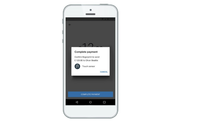
Quick KYC and onboarding
Make the onboarding process a delightful conversation instead of a daunting paper routine using smartphone features such as the camera (to capture ID documents), biometrics, social media data, and location-based services.
Request only the data you need to verify new customers. You can open up access to additional services progressively as customers perform various actions in your app and raise their trustworthiness score. As well, additional KYC procedures can be added for unlocking those features to stay on top of compliance.
MyBank (part of Ant Financial) uses the 3–1–0 principle for loan applications:
- 3-minute application for new customers, with most data being synced from users’ other profiles within the Ant Financial ecosystem
- 1-second approval
- 0 manual back-office operations, as these are outsourced to machine learning algorithms and predictive analytics
Straightforward UI for card ordering
Getting a debit/credit card post-verification should take just a few taps. Square Cash offers a great example of how to do that:
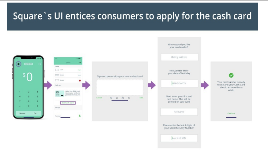
Source: CB Insights
Offer key account information at a glance
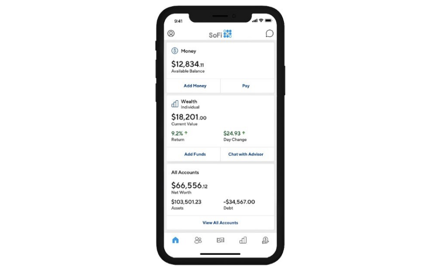
Provide an immediate overview of key account data: balance, expense analytics, outstanding/upcoming bills, plus some basic analytics. Revolut does a pretty good job with their main screen, offering progressive, one-tap discovery of insights as well as seamless navigation to additional features such as top-ups.
To get an edge, you can also introduce a more advanced analytics dashboard that shows users how they’re doing in terms of meeting their financial goals. If they’re meeting their savings goals, for example, you might suggest portfolio allocation or send other personalized wealth management advice.
SoFi managed to pack all insights into one neat interface:
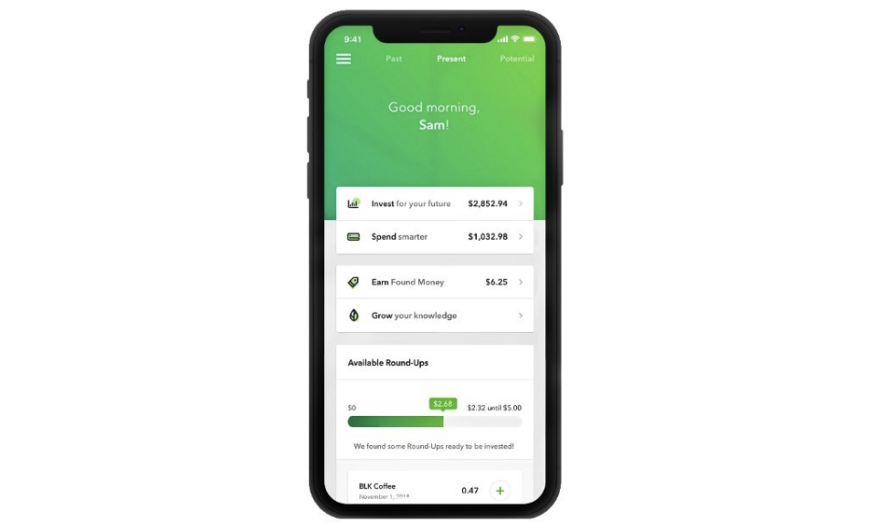
Finally, don’t forget about educating your users about their account options and personal finances (without sounding condescending). Acorns is one of the few FinTech apps that has an educational feature, offering users a stream of financial insights in partnership with CNBC:
Make the payment experience smooth, but do add some friction
This may sound counterintuitive, but bear with me for a second.
PayPal, Venmo, and the like set the bar for quick and easy payments. Borrowing a messenger UI to design a similarly smooth money transfer or account top-up experience is a good idea.
But a zero-friction UX can do more harm than good in FinTech products. Money matters, after all, are serious business. No user would be delighted to realize she just sent $1,000 to some spam contact just because doing so was “seamless” and “hassle-free.”
Thus, it’s worth adding intentional friction when it comes to major in-app actions or permanent account changes. Confirmation pop-ups, two-factor authentication, and other minor roadblocks can reduce risk of users taking the wrong actions.
Balancing a smooth experience and necessary friction is necessary for FinTech products.
Wrapping up
A better customer experience has been a strong differentiator between traditional banks and FinTech products. But as FinTech product portfolios grow, getting things right with the customer experience becomes harder.
By investing in predictive banking analytics and machine learning in finance, you can move away from mass pitches to suggesting ultra-personalized deals and actions to your customers based on their current life stages and a multitude of other factors.
Next, take weighted UX decisions that progressively lead users toward discovering more features while allowing them to do the essential stuff in a few taps.
That’s how you cook the ideal customer experience for a FinTech product.


